CSS units
Units in css use to set the distance/width/height or you can say Size of the elements.
There are two types of units
1) Absolute 2) Relative
1) Absolute:
a) Pixels
remember
96px = 1 Inch = 2.54 cm
e.g we use css property of font-size to set size of font.
font-size :10px;
2) Relative:
We say relative size mean every element size depend on it parent element size.
What does it mean?
Mean inner element size must be relative to parent element size.
if i say inner div width must be 25% than it will accupy the 25% width relative to parent element width size. Might be parent div is itself 50% in width of its parent element. Relative units are not fixed in sizes.
Relative units: %, em and rem
What is em unit?
em unit are use to apply on font-size of typography.
em font-size occupy font-size relative to its parent div.
What does it mean ?
I have two divs div1 and div2.
div2 is inner div of div1.
div1 have 16px of font-size and div2 will get same font-size if we define property in div2
font-size: 1em ,2em and so on...
0.5em is the half of parent font-size
NOTE:

Keep in mind, If we gave with 1em/2em it take size frim itself element not from parent elements.
What is rem unit?
font-size will be relative to root level element i.e 16 px.
Let say you set font-size of h1 to 5rem than it size will become 5 x 16 = 80px.
Other units:
vh: 1% realtive to screen height.
wh: 1% relative to scree width.
Display Property
Display: block / inline / inline-block / none;
Block: Block level element required/acupy/spans all available space/width.
inline: inline take only the required space (according to content inside it) (no margin and padding).
inline-block: It works similar to inline but we can set margin and padding in it.
NOTE: we cannot set width and height as well as top and bottom margin-padding for inline element. As we apply inline-block property than all properties will be applied on it.


relative and fixed, depending on the scroll position. It is positioned relative until a given offset position is met in the viewport - then it "sticks" in place (like position:fixed). FlexBox.
display: flex;
It is a one-dimensional layout where we set/arrange elements in either row wise or column wise.
one-dimensional way mean horizontal wise/vertical wise in the BOX or CONTAINER.
To make a div into flex-container / flexbox, we set property for this element is display: flex;

Note: Our main axis can be cross axis and cross axis can be act like main axis.
How ?
It will be discuss later.
When we set property.
display:flex;
flex-direction: row
than our main axis will be horizontal and cross axis at vertiotion direction.
When we set property.
flex-direction: column;
Than our main axis will be at vertical and cross axis at horizontal direction.
Note: Flex have another feature is it fit all elements inside the container event of he need to reduce/decrease the sizes of items.

Another propert called: flex-wrap: wrap
This property use when items set in multiple lines not in single line.
This property is use to manage space between the item line(space between oper wali or niche wali line k beech).
Than with flex-wrap:wrap property we use align-content property as well.
align-content properties
1) align-content: flex-start
2) align-content: flex-end
3) align-content: center
Code:
<!DOCTYPE HTML>
<html>
<head>
<meta charset="utf-8">
</head>
<body>
<p>
<!DOCTYPE html>
<br />
<html>
<br />
<head>
</p>
<style>
body{
text-align: center;
}
div{
width: 100px;
height: 100px;
border: 2px solid #000000;
}
#container {
width: 600px;
height: 600px;
display: flex;
flex-wrap: wrap;
justify-content: center;
align-items: center;
align-content: center;
}
#box2{
height: 200px;
}
</style>
<p>
</head>
<br />
<body>
</p>
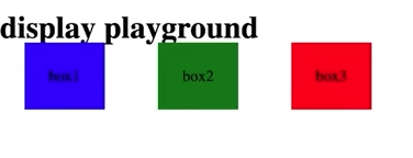
<h2>flex box container</h2>
<div id="container">
<div id="box1">box1</div>
<div id="box2">box2</div>
<div id="box3">box3</div>
<div id="box4">box4</div>
<div id="box5">box5</div>
<div id="box6">box6</div>
</div>
<p>
</body>
<br />
</html>
</p>
</body>
</html>
1) flex-wrap hum use krte han jab hmare items aik se zyada line pr jane chahyein.
2) jab hum flex wrap use kr lete han to hum notice krte han k hmare lines k beech mein kafi zyada space ha to osko remove krne k liye
or
sare content ki center/start/end postion set krne k liye hum align-content ki property us krte han. Agr smj na ae to oper wala example code run kr k deikho.
We have other properties lets take a look.


4) align-self
In all items, i want to apply align:start/center/end property on single item than i will use align-self property on that item.
flex-grow: This property is use to grow the single item multiple time greater than rest of items
by-default all items grow equally in size but if want one item grow double in size.
by-default flex-grow:1;
two increase size by 2,3 or 4 than i will use this property like so,
flex-grow: 2; // now item will be in double in width height than rest of items.
5) flex-shrink
It work same like flex:grow but in opposite way. it redice the size of the item with scale 1.
Media Queries
To create responsive website mean your web pages see beautifully according to your device width and height.
We use @media directive to style pages for particular device width.
Lets take example and understand the different type of media query uses.
Code
div{
width: 50px;
height: 50px;
background-color: green;
}
@media(width: 600px){
div{
background-color: pink;
}
}
Now what above code will do?
media query code will change bg color of div at 600px.
1) if you want to change color from 600 to so on than you will use min-width.
@media(min-width: 600px){
div{
background-color: red;
}
}
2) if you want to apply color from 0px width to 600px device width.
@media(max-width: 600px){
div{
background-color: red;
}
}
3) if you want to apply style within range from 200px width to 400px device width.
@media(min-width: 200px)and (max-width: 400px){
div{
background-color: gray;
}
}
Transitions
Transition enables you to define the transition between two stages of element.
What is transition?
It is the animation/ effects/ some physics (you want to rotate or move element) you want to apply on element.
Note: element show animation/some effects on present at same position on screen.
There are many properties use in transition. Basic properties we will discuss here.
1) transition-property: On which property of an element you want to apply transition e.g font-size, width etc.
2) transition-duration: here we define the time duration of showing transition effect.
3) transition-timing-function: This property define the behavour of transition effect on an element.
what does it mean?
Style of the effect.
different style can be ease-in, ease-out, steps, step(3) etc;
4) transition-delay: I want effect on element but after how many second/miliseconds.
transition-delay: 2s;
now element show its transition effect after 2 seconds of time.
CSS Transformation
Used to apply 2D and 3D transformation on elements.
What is transformation?
It is rotation and increase / reduce sizes of elements.
properties of transformation.
1) rotate property.
we can rotate our element upto 360 degree.
there are two unit used in rotation 1) degree 2) radian
but mostly unit use is degree.
let rotate div to 90 or 180 degree
div{
transform: rotate(90deg);
/*or*/
transform: rotate(180deg);
}
We can also rotate our element to particular axis
rotate: 45deg
rotateX: 45deg
rotateY: 45deg
rotateZ: 45deg
Rotation of element to X,Y and Z axis is use for 3D element/objects.
rotate to z-axis
div{
transform: rotate z 90deg;
}
2) scale property
Scale property is use to increase/reduce size of the element.
transform: scale(1);
you will see no effect because by-default value of scale of an element is 1.
when you add scale(2), the element increase in size /bigger in size to its original size.
same way
when you add scale(0.5), the element reduce in size /smaller in size to half of its original size.
What if i want to scale 2 time only in y axis
transform: scale(x-axis, y-axis);
transform: scale(1, 2);
the element will get double size in height.
3) translate
When we need to move element on screen from one position to second position in 2D SPACE.
we move our element across axis of the screen x,-x,y and -y.
transform: translateX(100px;)
now element will move 100px to left side(x-axis) by 100px;
We can also move element in different direction across x and y axis. let see how ?
transform: translate(100px,80px);
Now this element will move cross way between x-axis and y-axis.
3) skew
When i want to stretch element from its corners.
transform: skew(30deg);
CSS ANIMATIONS
css also offers animation templates(blue print) means the animation we get from transformation and transition that exectly we can get from keyframes animation.
We also no need to use javascript to get those animations.
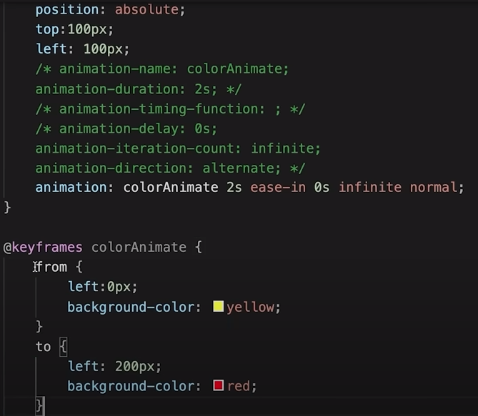
@keyframes in css is like an template that we bind/apply on element.
In this template we define the starting and ending behaviour of the element.
From Start to End what will be happend that will be my animation.

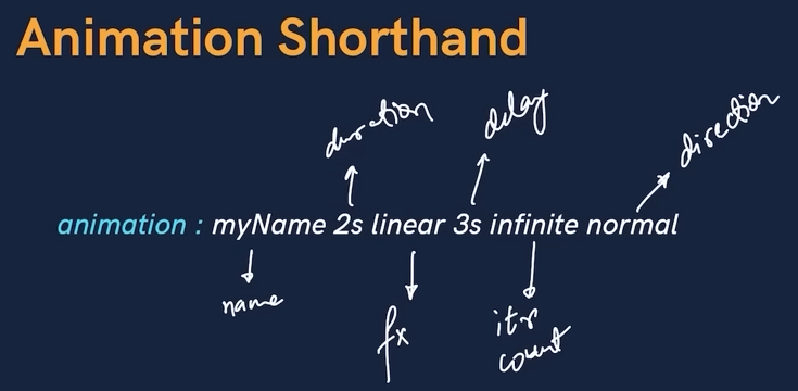
Example code:

Lets get blinking and infinite animation.
animation-duration: 0.25s;
animation-iteration-count: infinite;
Animation direction
1) normal: element move from to to.
2) reverse: element move to to from (reverse of normal).
3) alternate: element move from to to than reverse to to from.
4) alternate-reverse: it is reverse of alternate.
Example code:
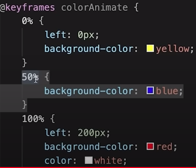
We can also add % in animation.
Example code:
Let make loader animation

Example code:

Some important css properties concept
width: fit-content:
This property i use on small dropdown menu. Its use is to set the width of an element to be wide as the content.This property is useful when you want widht not more than the required content.
we also use set
max-width: 300px; /* Optional: You can set a maximum width */
when we want our content within the specifies width(Not exceed that limit).
transform: translate(10px, 5px)
This property is use to move element across x-axis and y-axis
Comments
Post a Comment